Exercise 6 : Inventory Interface
Description
The exercise presents a simple physics-based shape-infused powder box of a game called “Principia Physica”. You are tasked with improving the user interface, using both visual and sound feedback to mediate player-game communication.
In case of any problems, please see the FAQ and the Problems and Solutions. If your problem is not listed, contact me by e-mail (Tomas Polasek : ).
Instructions
This exercise will take you through basics of all three visual user interface systems which are available in Unity:
- Creating a simple menu using the Unity GUI system
- Finishing style and actions for an inventory using Unity UI Toolkit
- Using Unity IMGUI to implement a simple debugging functionality
Download the project template from the Materials section and follow the same general procedure as in the case of previous exercises. In case of problems, see the information in the second exercise. Do not forget to switch to 2D mode.
After setting up the project and running the game, you should be greeted with a black screen.
Creating the Main Menu
Most games have some form of main menu. It is a nice custom and our game Principia Physica should be no exception. As you probably already saw, when we run the game we are greeted with a rather dull looking black screen. Let’s change that by creating a proper main menu using the Unity GUI system.
As the oldest available UI system within Unity it has some limitation, but it is mostly reliable and more than sufficient for our purposes. Its main feature is the fact that it is integrated with the main GameObject hierarchy. This means that UI elements - buttons, labels, etc. - are present in the scene hierarchy.
It consists of three main parts: Canvas, Event System, and the UI Elements. The Canvas represents the drawing area in which our GUI will be rendered. We already have a canvas within our scene, select it now from the hierarchy under Main/GameControl/UI/Canvas.
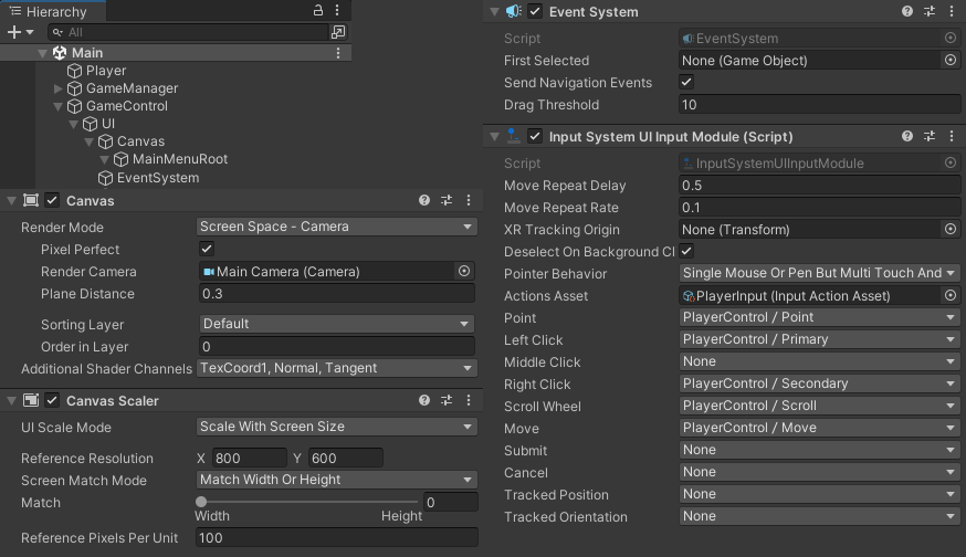
The primary components of a Canvas are the Canvas and Canvas Scaler. The first of them takes care of basic configuration. In our case, we use the primary camera as its target, which places it correcly into the scene window. Try changing the Plane Distance parameter and see it move within the scene view. It is actually a plane placed in the scene and can thus be occluded. Return the Plane Distance value to 0.3, which is just enough and prevents any occlusions.
The second component, the Canvas Scaler, perform scaling based on the actual screen resolution. This is important, since we may want to support many types of devices and this helps with making the UI usable on all of them. For further details, see the Unity Documentation.
While the Canvas takes care of the visual requirements, the Event System processes user input and passes it to the UI. You can imagine this as an input router. It considers which inputs are useful to the UI and distributes them to the correct elements. The important component in this case is called Input System UI Input Module, which is quite a lengthy name, but it gets its function across quite nicely. Its primary purpose is to take the inputs defined by some actions (Actions Asset) and translate them into common UI actions. These include, for example, Point for positioning the cursor, Left Click, Right Click, or Scroll Wheel.
Now that we know the basics of Unity GUI’s operations, let’s create our Main Menu. I already created an UI element within the scene, which is the MainMenuRoot containing the black background. When you select it, you can see that it has several interesting components. Chief amongst them is the Rect Transform. This is similar to Transform in that it is implicitly added to each UI element. It also serves to position the element relative to its parent.
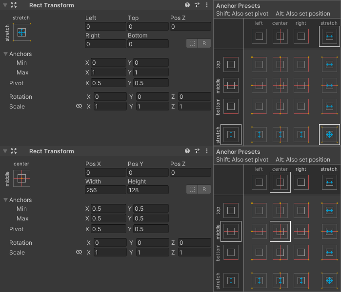
To better understand its function, create the background for our menu by right-clicking the MainMenuRoot and selecting UI -> Panel. This should automatically create a panel and stretch it to cover the whole canvas. Select your new panel and change its name to MMPanel (as a shortcut for MainMenuPanel). To make it look more like a menu, first select the anchor widget in top left corner and change to mode to center-center. For now, everything should look the same. To make it smaller, we still need to modify its dimensions. Do so by setting the Width and Height properties to some value - in the example, I use 256x256.
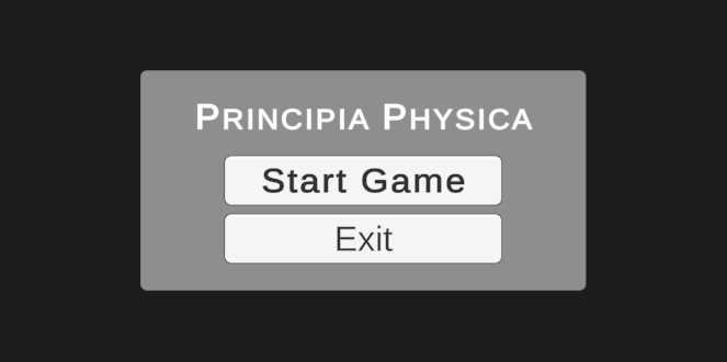
Now that we have a basic container for our main menu, we can continue with creating its content. Add a Text - TextMeshPro and two Button - TextMeshPro naming then MMTitle, MMBtnStartGame, and MMBtnQuitGame. We are using the TextMeshPro variants, which use improved font rendering, resulting in much nicer-looking texts. Now play with these three components, creating a menu with a title, and start / exit buttons. Note that the buttons have a child GameObject which represents the text. In case you find the floating icons in Unity Editor distracting, you can hide them by using the planet-like button at the top right of the viewport. When you are finished with the main menu, you should end up with something like:
You can now start the game again and try interacting with the UI. Buttons should be highlighting when you mouse over them and depressing when you press them with the left mouse button. But alas, nothing happens! This is to be expected, since we first need to connect the buttons to actions within the code.
To make the initial connection, select the MMBtnStartGame and scroll down to its Button component. Locate the On Click () section, which contains a list of callbacks triggered when we press the button. Since it is currently empty, not actions are performed. Fix that by adding a new callback (+ button in bottom right). Set the target object to Main/GameManager/GameManager and select the function GameManager -> StartGame. Be careful to select the correct GameManager from the scene hierarchy - note that the inner GameManager must be selected. To be sure, you can also drag it directly from the Hierarchy panel. Now, setup MMBtnExitGame in a similar fashion, using the QuitGame function. You can check out the definition of these function within the Scripts/Game/GameManager.cs (line 150, Task 1) file. Suffice it to say, they should allow us to Start and Exit the game!
The StartGame is already implemented. However, implementing QuitGame will be your first programming task in this exercise. Read through the (hopefully) helpful comment in the function and implement the quit functionality.
You will know that you have finished these tasks successfully when pressing both buttons performs the corresponding action - starting or quitting the game. The quit button should work both in the Unity Editor and the WebGL build!
Playing Inventory
You should now be able to actually get into our little game and be greeted with a simple scene with an inventory at the bottom:
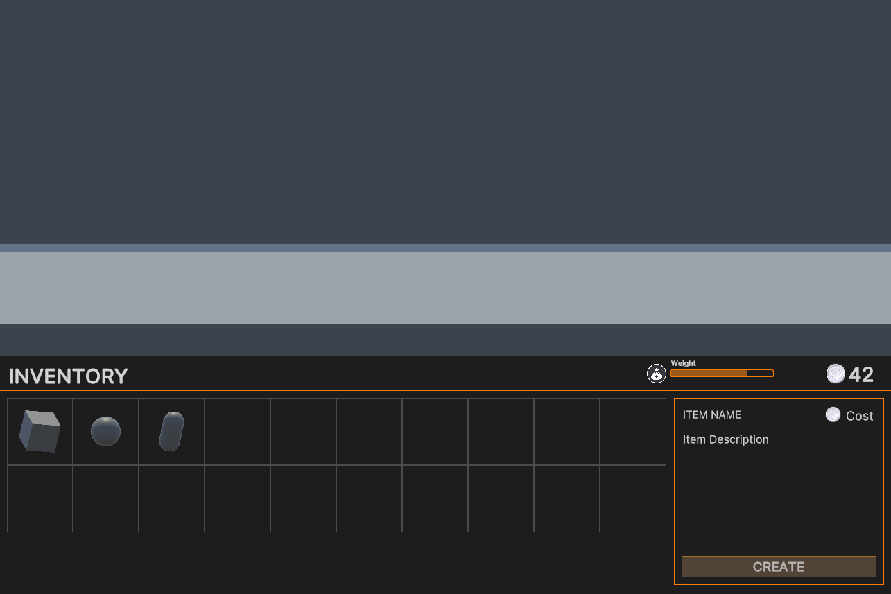
This gets us to the second UI system available within Unity, the Unity UI Toolkit. This system is the more recent one and is much more similar to other UI design tools you may have seen in the past. Instead of the GameObject hierarchy, it uses only a single component.
To take a look how it works, select the Main/GameControl/UI/Inventory GameObject from the scene hierarchy. Everything related to UI Toolkit is contained within the UI Document component. As you can see, there is not much. The Panel Settings contains settings similar to the ones present within the Canvas. Note: you can jump to the PanelSettings asset by left clicking on the box and then open it to see the available configuration options. Next is the Source Asset, which contains the UI template, representing the UI design itself. Finally, when we have multiple overlayed UIs, we may want to render them in the correct order, which can be accomplished by the Sort Order property.
Onto the most important part of UI Toolkit - UI Templates. Each UI is represented by a single XML-like file, along with optional CSS-like styles. Locate the template for our inventory UI under Assets/UI/Inventory and double-click the InventoryTemplate asset. This opens the UI Builder window, which is used as the primary tool for UI design within UI Toolkit:
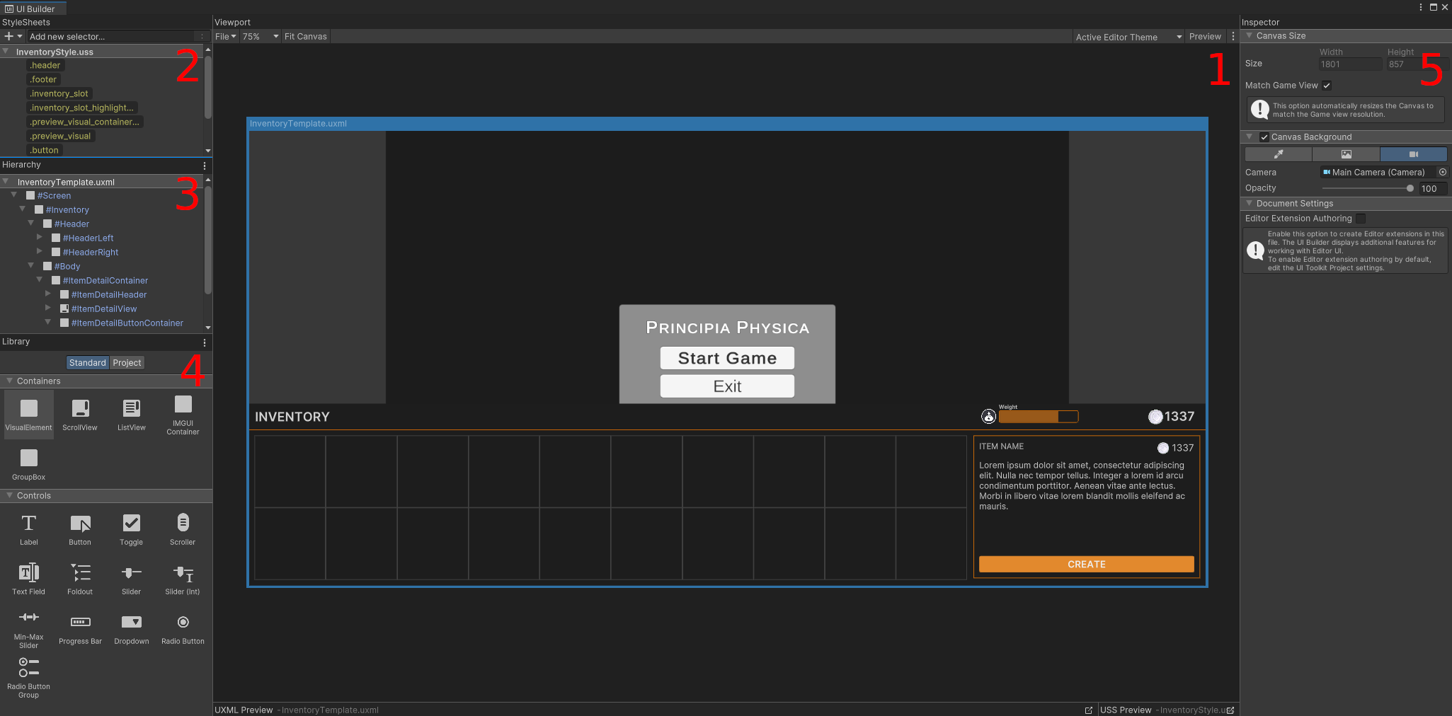
If the opened editor contains a preview for a small screen, you can switch it to current resolution by selecting InventoryTemplate.uxml from the Hierarchy on the left and enabling Match Game View in the Inspector on the right. The window consists of 5 separate areas. First is the working area (1), which displays the current user interface design. Within this area, you can point and click on any of the UI elements to select them. Next, we have the style sheets (2) panel, which contains currently loaded styles. The UI toolkit utilizes CSS for styling, which is supported almost entirely thanks to the webkit implementation. We can see the UI hierarchy (3) in the next panel. This is the tree structure, which represents the UI on a conceptual level. The library of UI elements (4) contains all available elements which can be placed within the UI by simply clicking and dragging them into the working area. Finally, the inspector displays information about the currently selected element.
Now, lets take a look at how styling works in UI Toolkit. Select the CREATE button (ItemDetailButtonCreate) and turn your attention to the Inspector panel. Immediatelly, you should feel quite familiar with the nomenclature, if you ever created web pages using HTML and CSS.
As your first task, you will be modifying the style of the CREATE button to reflect its buttonness. Currently, when you start the game and hover over the button or interact with it in any other way, you don’t get any feedback as to its interactive nature. It is important to signal the user that the button is interactible so that they are not confused by our UI. This is best accomplished by slight changes in the button color when we hover over it, press it, or disable it.
When you check the StyleSheet section in the Inspector, you can see that we already have a style created for this button. It is called .button, and you should now locate it in the StyleSheets panel (2). Since we want to modify the button’s color under special circumstances, we can use the CSS selector functionality. Right-click on the .button style in the StyleSheets panel and duplicate it. Rename the duplicate to .button:hover, where the :hover specifies that this style will be used only when cursor is hovering over the element. Now, change its color in the Inspector (Background -> Color) to be of slightly ligher shade. Now repeat this process for pressed (:active) and disabled (:disabled) states, selection appropriate colors (Task 2a):

Save the template and test your current configuration in-game by running the game in the Unity Editor. You should now play with the UI Builder and the Inventory UI, styling it to your liking. For more information, you can also see the Unity Documentation. When you are comfortable with the results, you can continue with the exercise.
As you press the CREATE button, you must be certainly thinking “Gee, it would be great if this button actually created something!” Well do not fret, perspective future game developer, because that is exactly the goal of your next task. But first, we should do something about the general description that is currently displayed in the ItemDetail section of the inventory.
Locate the method UpdateSelectedItem in file Scripts/UI/Inventory/InventoryManager.cs (line 370) and read through the provided comment (Task 2b). This should lead you in the direction of updating the item details with the correct information. After you are finished, you should run the game, select an item in the inventory (left click) and check that the information is updated:

Now onto the button functionality. First, you need to assign a function to the button’s clicked Action. Do this now by reading through the comment on line 138 in the same file (InventoryManager.cs, Task 2c). Then, continue with the actual implementation of the CreateItem function at the bottom of the file (line 376, Task 2d).
Great, now test your item creation in-game! You should be able to select item, read its description and cost, and then create it with the CREATE button. Make sure that the currency in the top right corner of the inventory gets reduced as you buy the items!
This concludes this part of the exercise concerning the UI Toolkit. If you want to check out other features UI Toolkit has in store, be sure to look at the Window -> UI Toolkit -> Samples and Debugger!
The Cheaters Paradise
The last way to create visual UI in Unity is through the Unity IMGUI system. IMGUI is a generally available library and Unity mediates its functionality through a wrapper library called GUI (and GUILayout, GUIEditor, …). It differs from the other UI systems quite starkly. First, it has no design tool to speak of. It is completely defined in code. Second, it is realized as an immediate-mode library. This means that as the code is executed, both the element definition and logic is running.
Everyone likes game cheats! Even our little game has a debugging / cheating window hidden within. To open it, press Shift + grave (tilde, ~) key on the keyboard. As you can see, it is currently quite limited. All we get are some (arguably quite nice) sliders and a button which doesn’t even work. Lets fix that now.
Your next task will be to implement some nice debugging and cheating functions for our game. We should start with the already existing Enable Dummy Character button. Go to the Assets/Scripts/UI/DebugMenu/DebugMenuUI.cs file and locate the place where we define the button. You can do so by searching for the button label’s text. As you can see from the code creating the VerticalSlider elements (in the code, above the button), IMGUI is realy using immediate-mode. We define the elements by calling the GUILayout.VerticalSlider(…) function, and provide the value as its parameter. Then, we get the resulting value returned. If we move the slider using a mouse, the returned value will be different from the input value. Thus, we store it back in the same variable, leading to a simple “data binding”-like behavior.
Now, get onto the task of implementing button’s functionality by reading the task task description within the provided comment in the code (DebugMenuUI.cs, line 183, Task 3a). Once you finish this, you should be able to start the game and, once you are in the scene, open the Cheat Console and enable the Dummy Character. You can control it by using the standard controls (WASD, Control, Space, Escape).
Having a character running through our scene may be interesting, but where are the cheats? Continue reading through the comments in the MainWindowUI function, specifically look for the Task 3b. Once you have finished this task, you should be able to spam CREATE to you hearts desire. When you run out of funds, just cheat up some more!
Your final task, designated Task 3c, will be the creation of UI elements which allow control for several normally hiden game features. One possible configuration of the Cheat Console is as follows:

Once you finish this task, you should test all of the elements in-game and make sure they work as expected. You can test the sound by colliding some items together.
Bonus: Sounds and Items
If you are interested in how the sound system works in Unity, I recommend you to take a look at the SoundEffect.cs and CollisionSound.cs files in Assets/Scripts/Sound. While, you can simply create an AudioSource for each sound effect, this is quite inefficient. For this reason, I have also created a sample implementation of sound pooling - SoundEffectPooled.cs. However, using the sound assets can be cumbersome. For this reason, the SoundManager.cs abstracts this portion away, allowing sound effects to be identified by strings, while also allowing AudioSource pooling.
One nice thing about Unity is that we can define new types of assets from code and then create and use them within the Unity Editor. This is what is used in the template to represent the inventory items. An item is created as a special asset, defined within the file Assets/Scripts/UI/Inventory/ItemDefinition.cs. Then, we can create new item assets by using the right-click menu in the Unity Editor Project window: Create -> Data -> Inventory -> Item. For examples of existing items, see Assets/Data/Inventory. Then, we can use them as normal assets, in this case we have the PlayerInventory component placed on the Player GameObject. You can try creating new items by using the Create menu and then adding the to the PlayerInventory. I have provided some interesting Platonic (and other) shapes in the Assets/Meshes/Prototype/Primitive/ folder.
One last interesting thing are the item previews within the inventory. Wonder how is this implemented? Well, start the game, go back to the Scene mode within the Unity Editor and fly around (look around coordinate (20, 0, 0)). This is implemented in the PhotoBooth.cs and PreviewGrid.cs scripts. While there are certainly easier ways do this, this approach is quite flexible.

Submit the Exercise
Submit the results according to the procedure detailed in the Exercise Submission chapter.
Task checklist:
- Create a simple menu with Unity GUI, allowing the player to Start and End the game
- Stylize the inventory using Unity UI Toolkit and implement the CREATE button
- Create a simple debugging menu with Unity IMGUI
FAQ
Following are some problems and solutions which may occur during this exercise:
- WebGL quit code does not execute : The UNITY_WEBPLAYER define has been deprecated in newer versions of Unity. Try
changing the line from
#elif UNITY_WEBPLAYERto#elif UNITY_WEBPLAYER || UNITY_WEBGL. - Problems with importing the Impact sound clips : It is possible that the import was blocked by your antivirus software. Try disabling it for a moment and reloading assets with Control + R.
Materials
Project Template : [zip]
Credits
All of the non-original assets are credited in enclosed text files
During the creation of the inventory UI I used the base implementation from gamedev-resources.com